
One of the main reasons I started this blog was to rant about New York’s shitty user experiences. My mind is blown at just how often in day-to-day life a poorly implemented or substantially antiquated user experience is foisted upon you.
I’m going to start with one experience (done two ways!) that makes me cringe. The MTA (Metropolitan Transportation Authority) administers all of New York’s public transport infrastructure: subways, busses, trains, bridges, and tunnels. They also created this abomination:
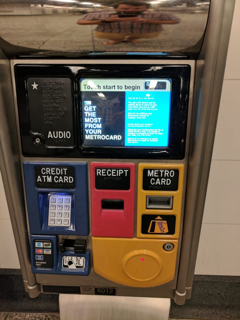
This is a MTA Metrocard ticket machine, where you can purchase or top-up your ticket.
The main use-case for this machine is topping up your Metrocard (they do expire, but they have a relatively long shelf-life). To do so you:
- Start on the top touch-screen and select top-up (I’ll do a separate piece about that UX);
- Insert your Metro Card on the right;
- Go back to the screen and select your top-up amount;
- Put in your credit / debit card on the left;
- Collect your receipt (if you want one) from the middle.
What do I find so offensive about this?
- Normal workflow is left to right. Here it’s Right to Left to Right.
- The vast majority of the population (90%) is right handed, yet the activity requiring the greatest amount of dexterity (using the keypad and “dipping” the credit card) is on the left.
- There are too many transitions from the touch screen to the physical interface (You need to press start > top-up, then insert your Metrocard, then select a top-up amount. You can’t just insert the Metrocard at the start of the process).
Now, this is poor design, but is it truly shitty? I think so, but if you need to be further convinced…
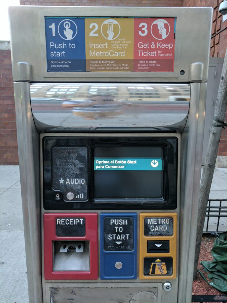
The purpose of this machine is to take your metrocard (that you’ve already topped-up at another machine) and to dispense a paper ticket for the bus. Yes, that’s right, it takes one form of ticket to create another form of ticket.
So I question the need for this machine at all and, in fairness, not all bus routes need them as some busses have Metrocard readers in them. This does create additional confusion though, as you need to scope out the bus-stop to verify what form of ticket you will need.
That aside, the process starts off well on this machine. The instructions are clear on the left-to-right chevrons:
- Press the start button (left, blue)
- Insert your Metrocard (middle, yellow)
- Get your ticket (right, red)
Simplicity itself. Wait? WHAT‽‽‽‽ The actual execution is then
- Start (middle, blue)
- Metrocard (right, yellow)
- Ticket (left, red)
What on earth were they thinking! In addition to the above, I again question the need for a start button, and despise the fact that the most dexterously challenging activity is in front of your left hand (pulling out those tickets is a PITA).